Brand Guidelines
Define your visual identity once — every page you create automatically follows it.
What are Brand Guidelines?
Brand Guidelines are a set of design rules that define how your landing pages look: colors, fonts, button styles, form inputs, and layout tokens. When a brand is assigned to a site, every page on that site — whether generated by AI or created from a template — follows these rules automatically.
This means you can spin up new landing pages in minutes and they all look like they belong to the same organization. No designer needed.
Creating a Brand
- Go to Brands in the dashboard navigation
- Click Create Brand
- Give it a name (e.g., "AFP", "Summer Campaign", "Product Line A")
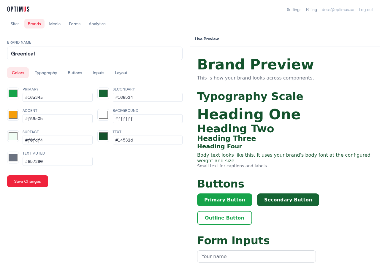
- Configure the five tabs: Colors, Typography, Buttons, Inputs, Layout
- Use the live preview on the right to see your changes instantly
- Click Create Brand
What You Can Configure
Colors
Seven color roles that map to every element on your pages:
- Primary — main brand color (buttons, links, accents)
- Secondary — secondary actions and supporting elements
- Accent — highlights, badges, attention-grabbing elements
- Background — page background color
- Surface — card backgrounds, elevated sections
- Text — primary text color
- Text Muted — secondary text, captions, labels
Typography
- Heading font — used for all h1-h4 headings
- Body font — used for paragraphs, buttons, form labels
- Weight and case — heading weight (300-900) and text transform (normal, uppercase, capitalize)
- Type scale — exact sizes for h1 through small text
You can use any Google Font (self-hosted, no external requests) or upload your own custom fonts in .woff2 format.
Buttons
Three button variants are generated from your configuration:
- Primary — solid background in your primary color
- Secondary — solid background in your secondary color
- Outline — transparent with a primary-colored border
Configure border radius, padding, font weight, text transform, and hover effect (darken, lighten, lift, or glow).
Form Inputs
Text inputs and textareas use your brand's border radius, border color, padding, and focus ring style.
Layout
Global layout tokens: max content width, section padding, border radius for cards, and shadow style (none, subtle, medium, dramatic).
Assigning a Brand to a Site
Go to your site's Settings → General tab and select a brand from the Brand Guidelines dropdown. All pages on that site will use the brand's styles.
Default Brand
If your account has a default brand, new sites are automatically assigned to it. You can set a brand as default from the Brands list page.
Multiple Brands
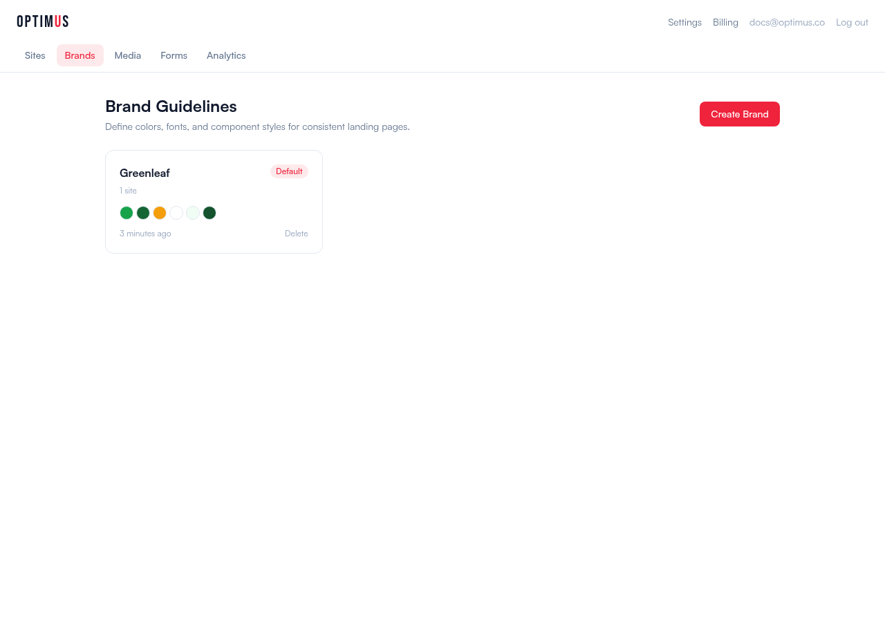
Organizations often have multiple brands. For example, a parent organization with sub-brands for different campaigns, products, or subsidiaries. Each brand has its own color palette, fonts, and component styles.
Create as many brands as you need. Each site is assigned to one brand. The brand selector shows color swatches so you can quickly identify each one.
How It Works Under the Hood
Brand guidelines are compiled into CSS custom properties and component classes that are injected into every page:
--brand-primary,--brand-text, etc. for colors.brand-btn-primary,.brand-btn-outlinefor buttons.brand-inputfor form fields- Heading element styles (h1-h4) for typography
When AI generates or refines a page, it receives the brand CSS and is instructed to use these classes instead of inventing its own styles. This ensures pixel-perfect consistency across every page.